Persimmony needed a modern, intuitive design to unify their software tools and simplify workflows for users serving community care. The key objectives:
Introduce a refreshed brand identity that conveys approachability, security, and clarity
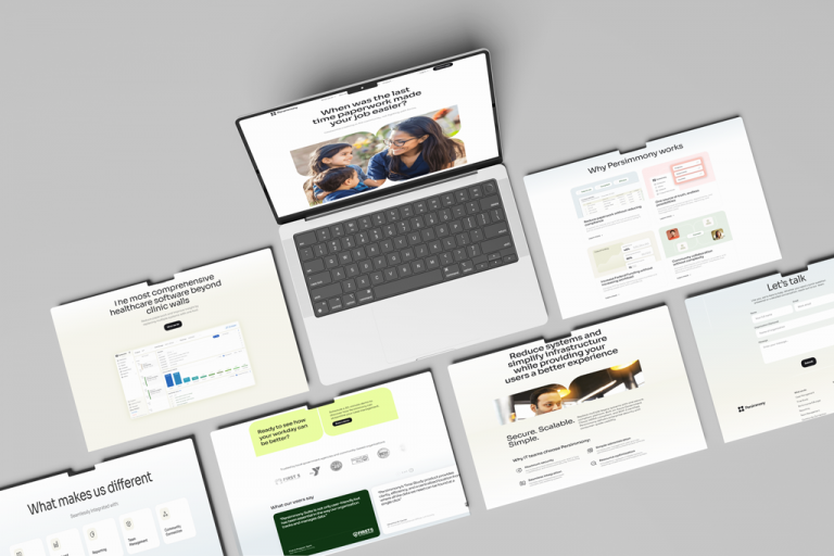
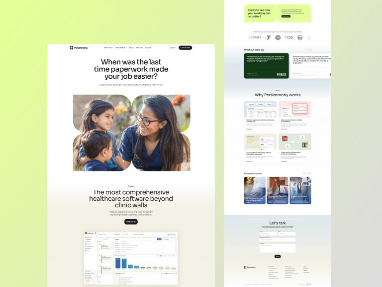
Redesign the website for better UX and conversion
Brand Identity Refresh
Logo Redesign: Expanded on the persimmon tree metaphor—petal shapes signal growth and care, framed by a secure square to communicate reliability
Visual Guidelines: A refined color palette, modern typography, and fresh iconography applied across web, email, and product touch
Website UX/UI
Consistent UX Patterns: Unified button styles, popup flows, and exit controls—designed with subtle yet meaningful improvements to streamline user interactions
Responsive Design: Seamless experience for desktop and field workers on mobile, including mobile-first interactions for time study and case management tasks
Results & Impact
Enhanced usability — Users report faster workflows and fewer errors thanks to standardized UI elements
Stronger brand alignment — The polished identity supports Persimmony’s mission and enhances trust
Better conversion — Clearer message hierarchy and strategic navigation enabled more demo requests, resource downloads, and sign-ups